Best Practices for Translating into Chinese
Experts predict enormous market growth in China over the next decade, and many companies are hoping to enter that market successfully. Breaking into the Chinese market requires a long-term strategy, and local contacts. But also essential, is translating your documentation into Chinese. In this article, we offer some best practices when translating into Chinese.
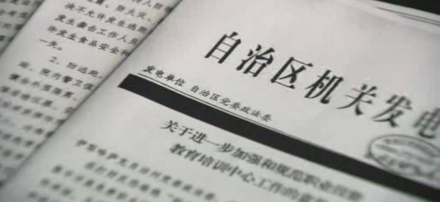
Historically, Chinese was written either vertically, from top to bottom and right to left, or horizontally, from right to left. But, for many years now the official standard has been horizontally from left to right. Many newspapers, however, often combine this with a vertical layout, for example with horizontal headlines and vertical text.
For a long time, few graphic design programs were designed with anything other than English in mind; so handling text layout in Chinese and other non-Latin scripts was fraught with problems.
Thanks to the development of programs such as InDesign, these problems have become more manageable. It is now possible to produce first class layouts in both simplified and traditional Chinese script; utilising all of the functionality that InDesign makes possible for the Latin alphabet.
Chinese presents a number of specific challenges to desktop publishing specialists:
Spacing
There are no spaces within a given paragraph of Chinese, nor any indication of word boundaries. This is because Chinese is a syllabic system, in a which a word will never be longer than two syllables (i.e. two characters). Punctuation, of course, must follow the Chinese rules, using Chinese punctuation symbols. (Interestingly, classical Chinese doesn’t use any punctuation at all!) As in the case of Arabic, foreign phrases are used quite freely, either in the original Latin script or transliterated into Chinese. Of course, this too must be properly handled.
Italics
Technically, Chinese does not use italics, although some publications do choose to “slant” the font. However, it is preferable to accentuate text using different weights (bold/semibold, etc).
Font
There are many different Chinese fonts available, and it is part of the designer’s responsibility to choose one which is appropriate to the style and register of the document. Ideally, it should aesthetically match the source font — for example, serif or sans-serif. And, in order to avoid the kind of compatibility pitfalls which were a problem even a few years ago, the font must be based on the Unicode standard in order to be able to handle all the 60, 000+ characters.
Layout
Aesthetically, blocks of text are more pleasing — avoid widows, orphans and ragged edges.
As usual with translated texts, it is very important for the desktop publishing specialist to have at least some basic knowledge of the target language. They must also be aware of the fact that, unlike Italian, for example, which generally takes up 20-25% more space than the English it is translated from; a Chinese translation will occupy a good deal less space than the original, alphabetic source. This is partly due to the fact that each character represents a whole syllable, and partly because Chinese is a notoriously concise language. As a result, some flexibility within your layout is advisable.
These are just a few of the issues which translators and desktop publishing professionals need to bear in mind when working with Chinese, and they serve to underline the importance of entrusting this work to experienced specialists.

